
Dark Side of the Moo
Brand Identity
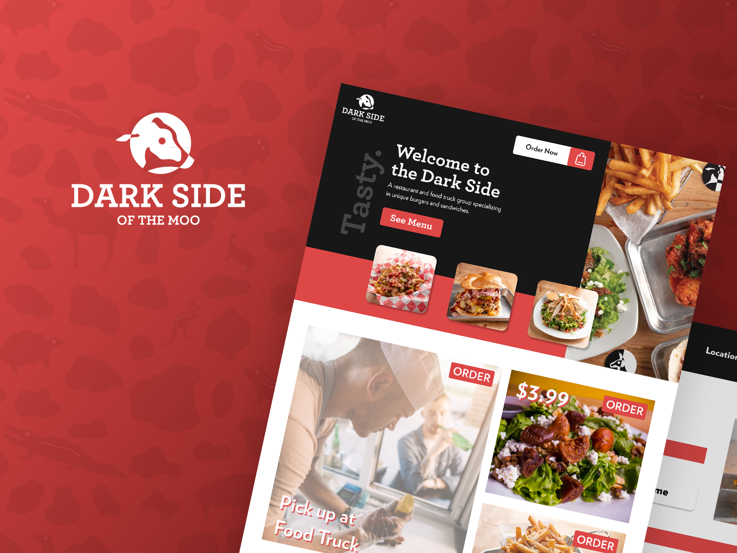
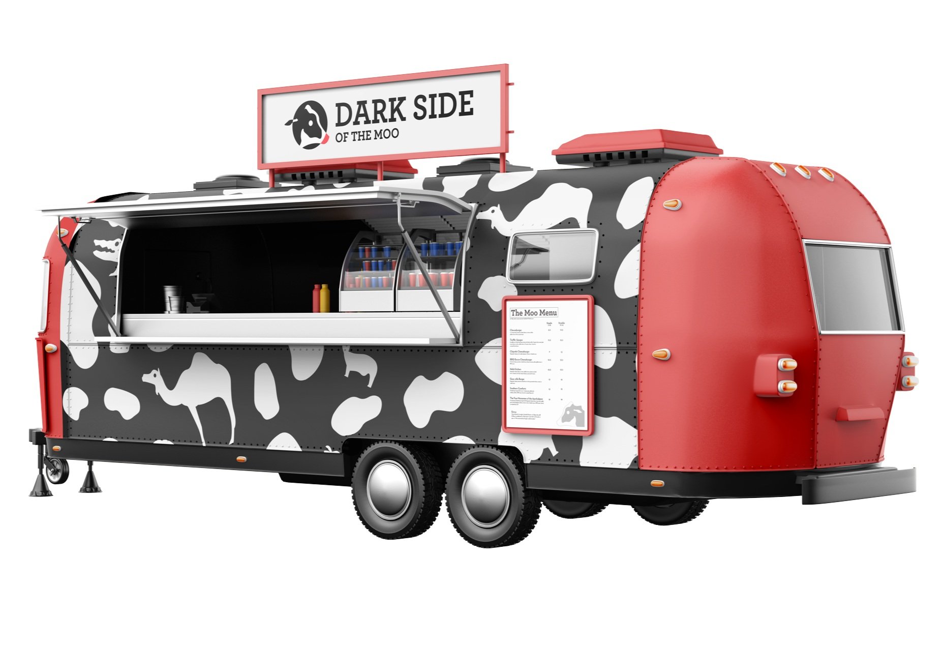
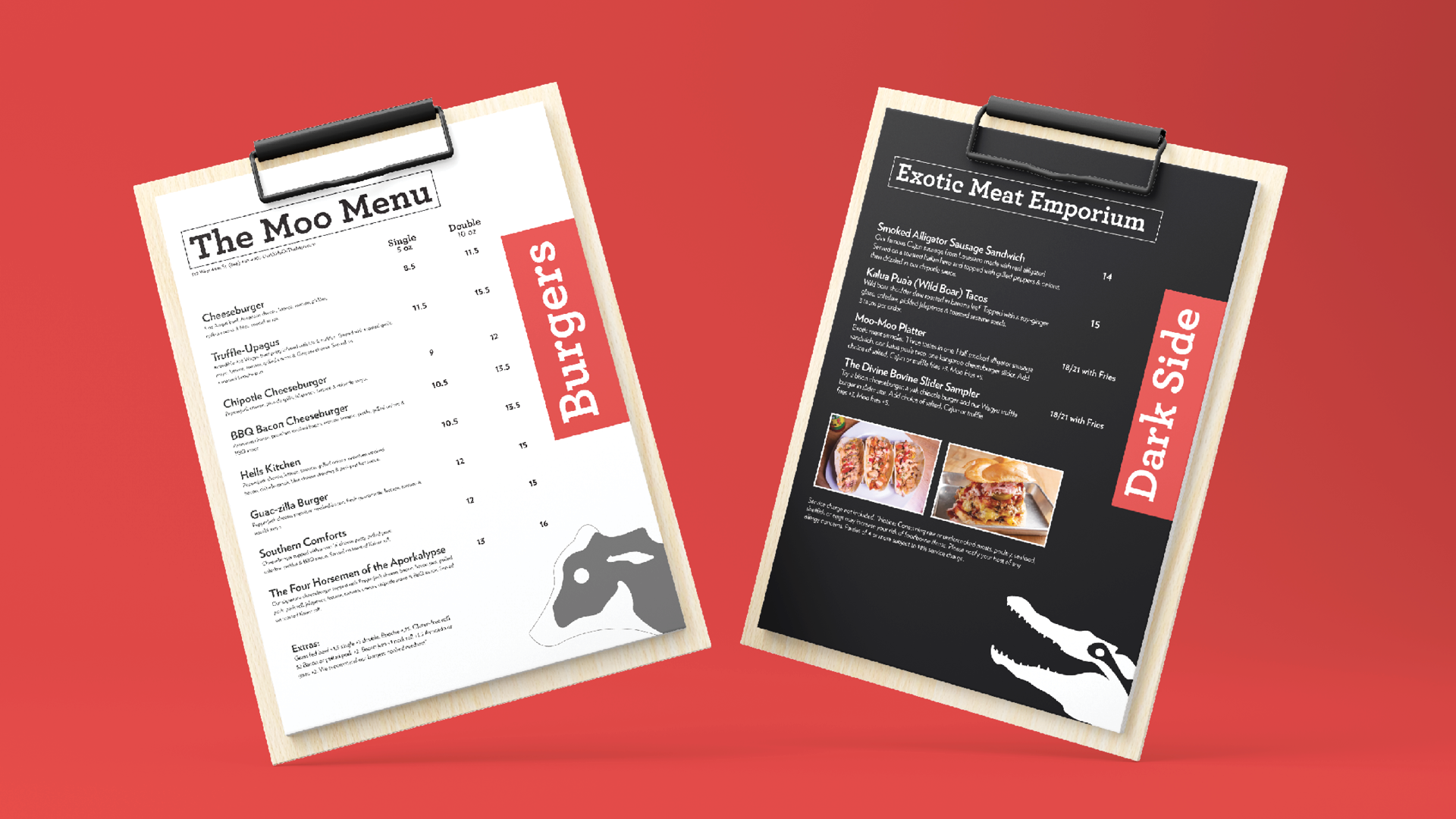
Rebrand
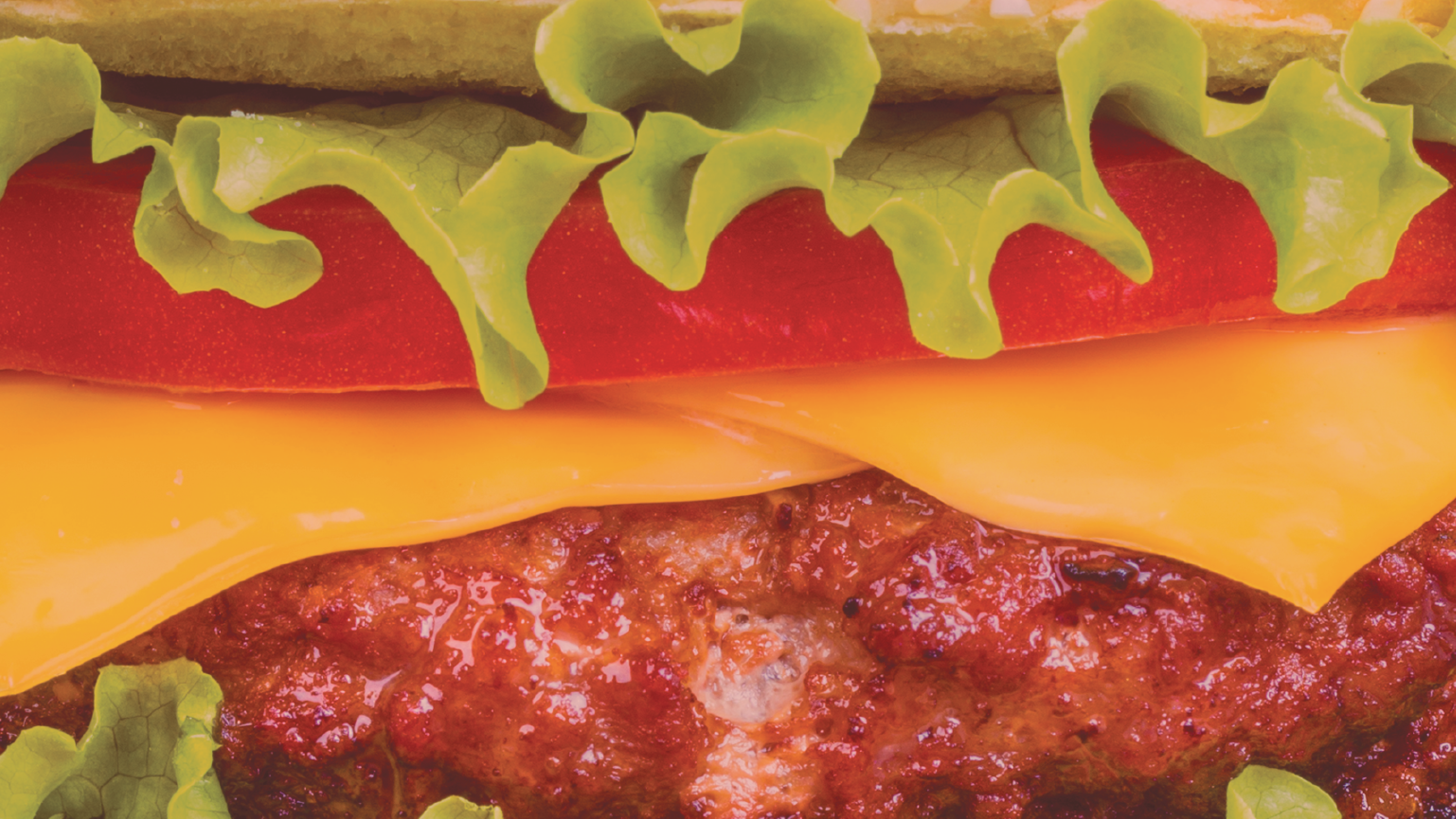
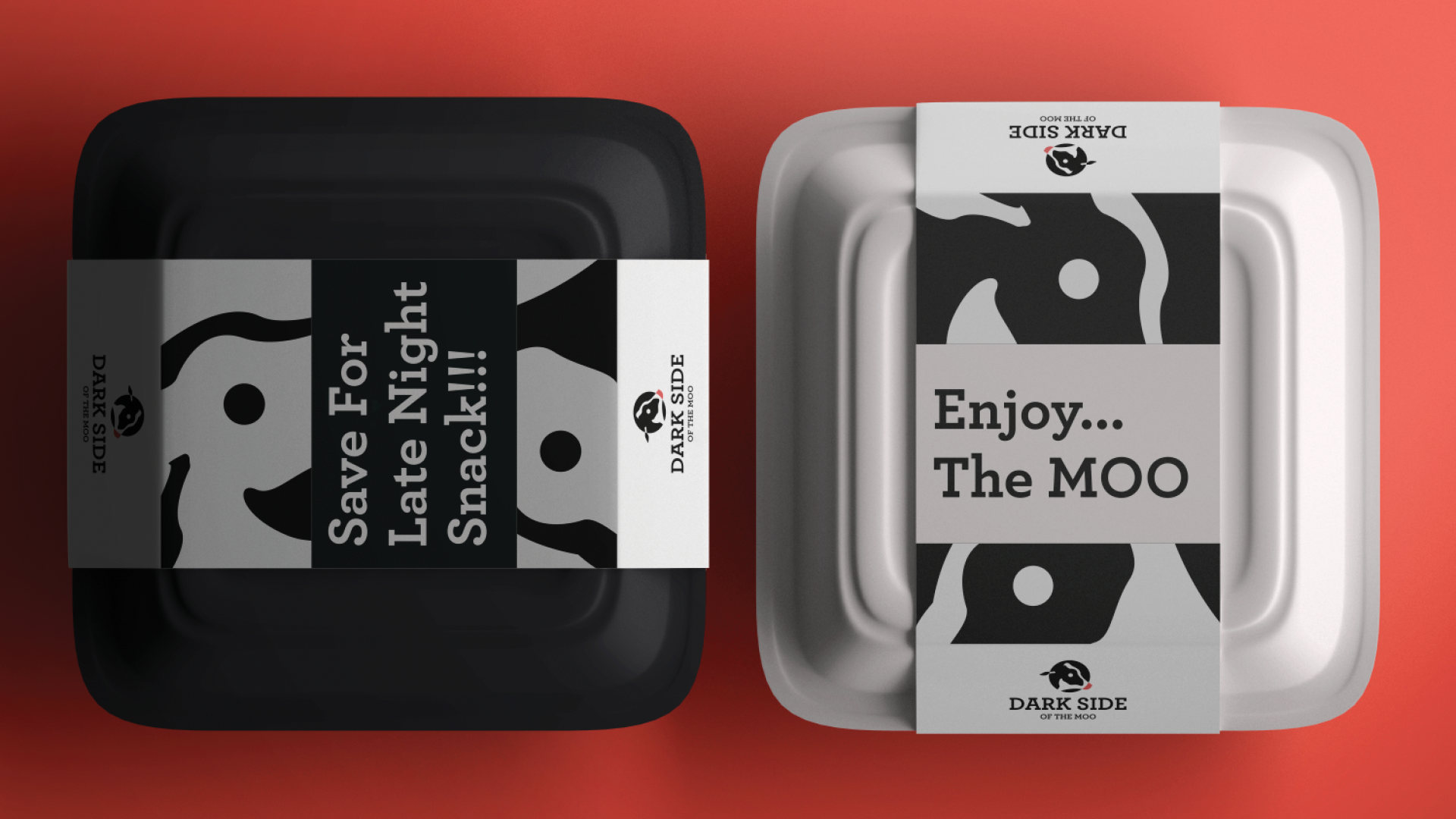
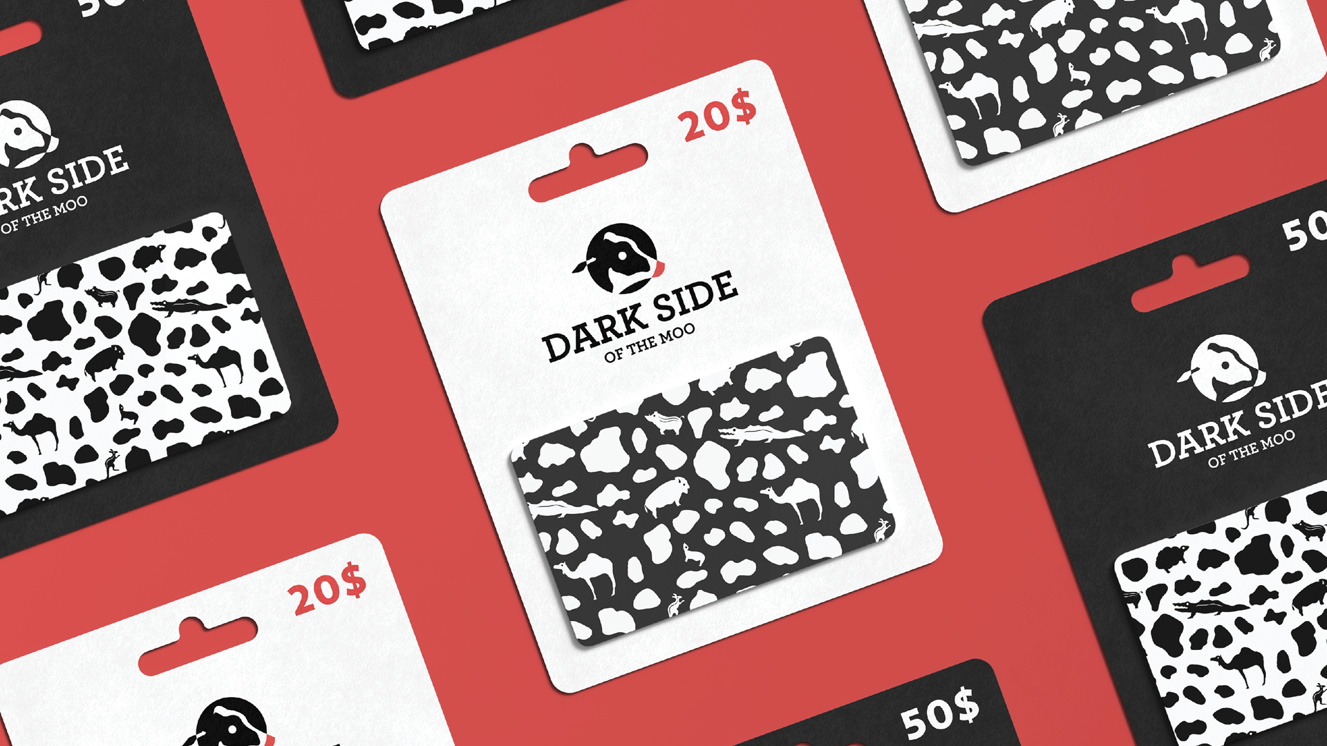
Dark Side of the Moo is an exotic meat emporium striving to bring extraordinary to the masses.
The black circle with the cow emulates the shadowy crescent of the moon, symbolizing the meat itself. The animal illustrations were created in a minimal and abstract style, appealing to a broad demographic of children and adults. The color palette remained untouched, except for the red color, which is brighter to differentiate the identity from other restaurants and to attract more users.


Selected Works
Dark Side of the MooBrand Redesign

OrgulloSocial Design
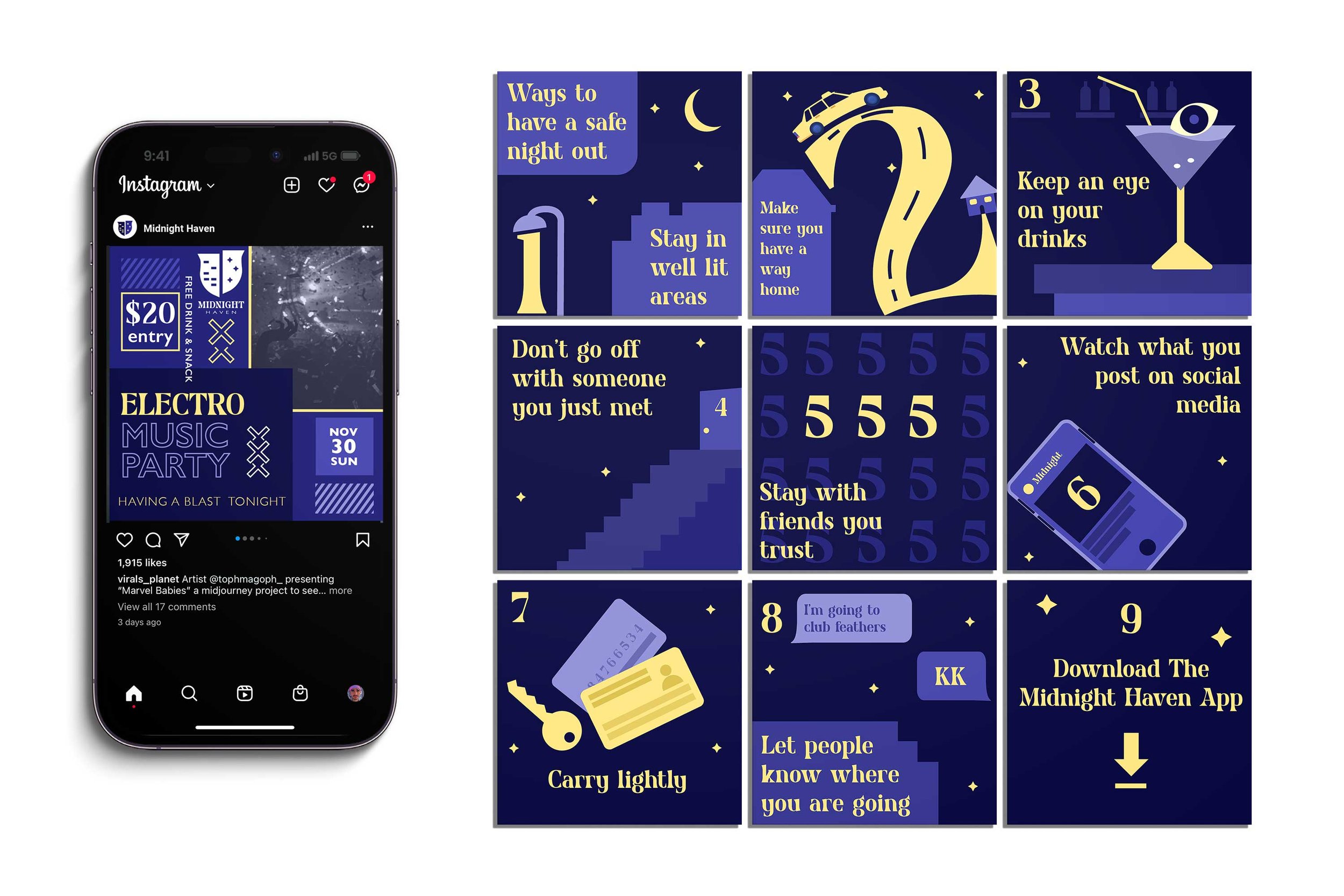
Midnight HavenSocial Design
European Wax CenterCommercial Portfolio

JD at NikeCommercial Portfolio
© 2024 manuelhernandez.design